
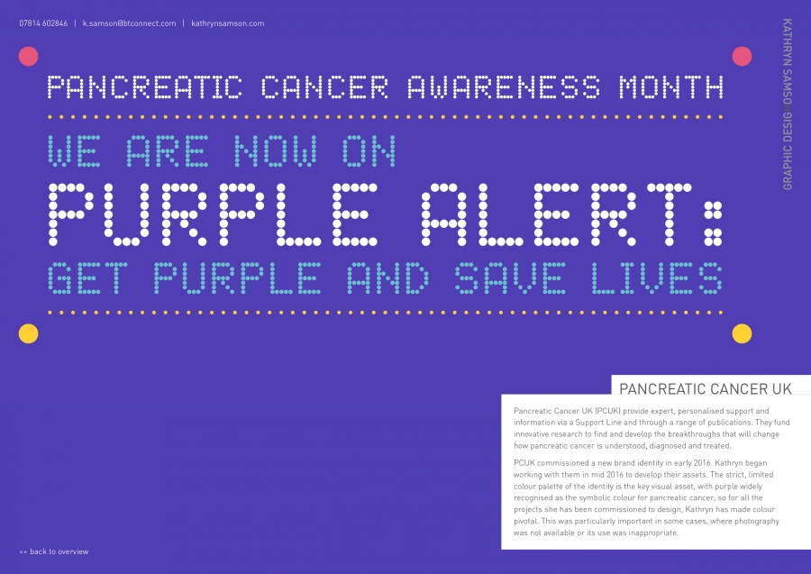
Pancreatic Cancer UK (PCUK) provide expert, personalised support and information via a Support Line and through a range of publications. They fund innovative research to find and develop the breakthroughs that will change how pancreatic cancer is understood, diagnosed and treated.
PCUK commissioned a new brand identity in early 2016. Kathryn began working with them in mid 2016 to develop their assets. The strict, limited colour palette of the identity is the key visual asset, with purple widely recognised as the symbolic colour for pancreatic cancer, so for all the projects she has been commissioned to design, Kathryn has made colour pivotal. This was particularly important in some cases, where photography was not available or its use was inappropriate.
No one has liked this image yet, why not be the first!

