
A BRAND MUST ALWAYS HAVE A STORY BEHIND TO SUPPORT ITS VALUES
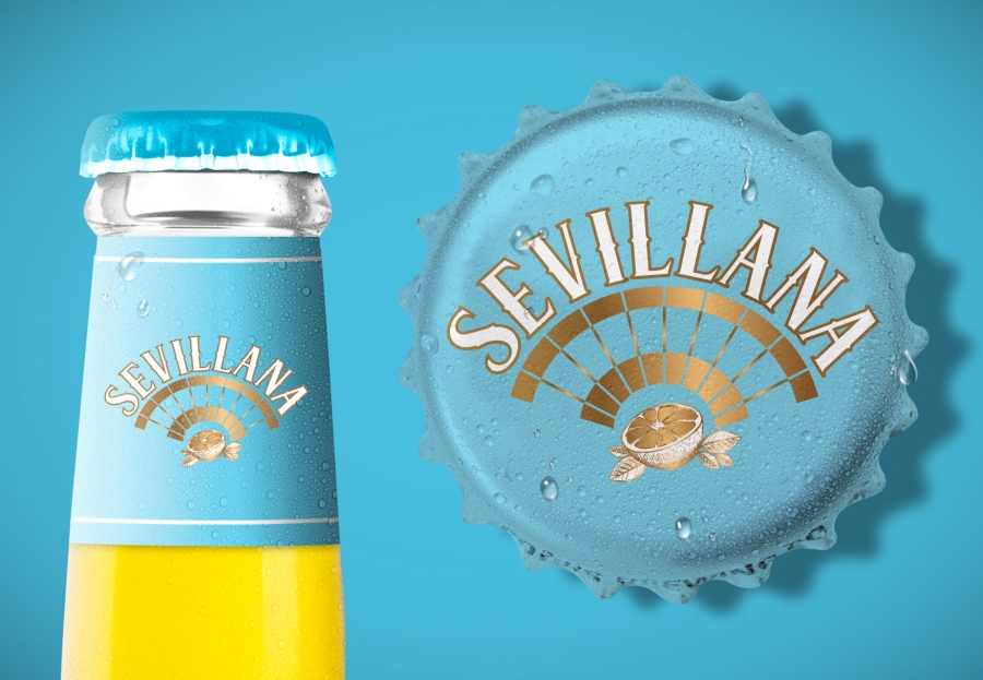
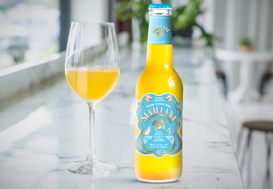
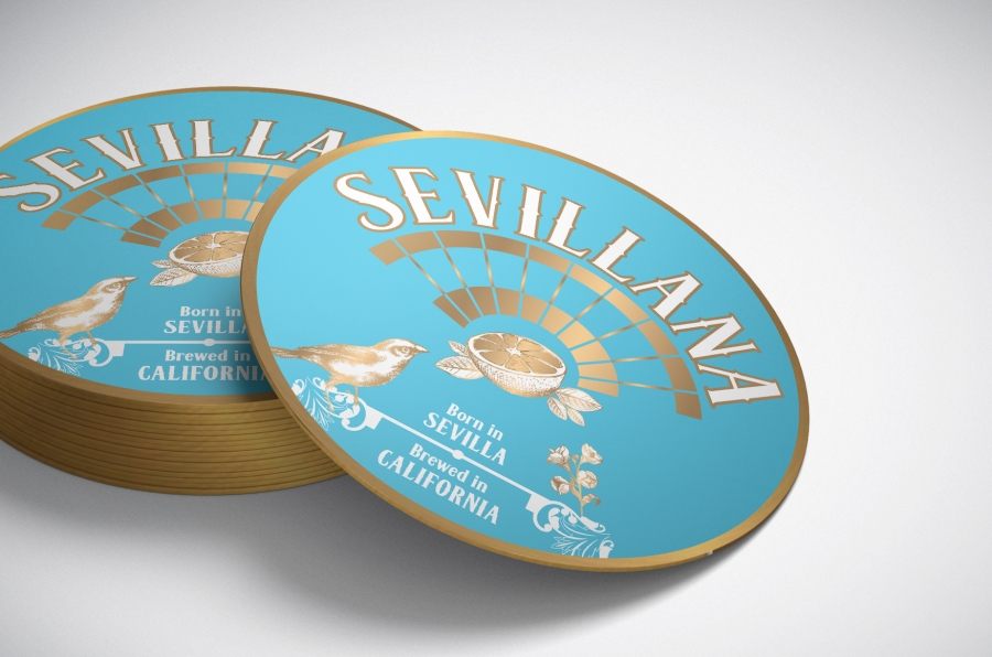
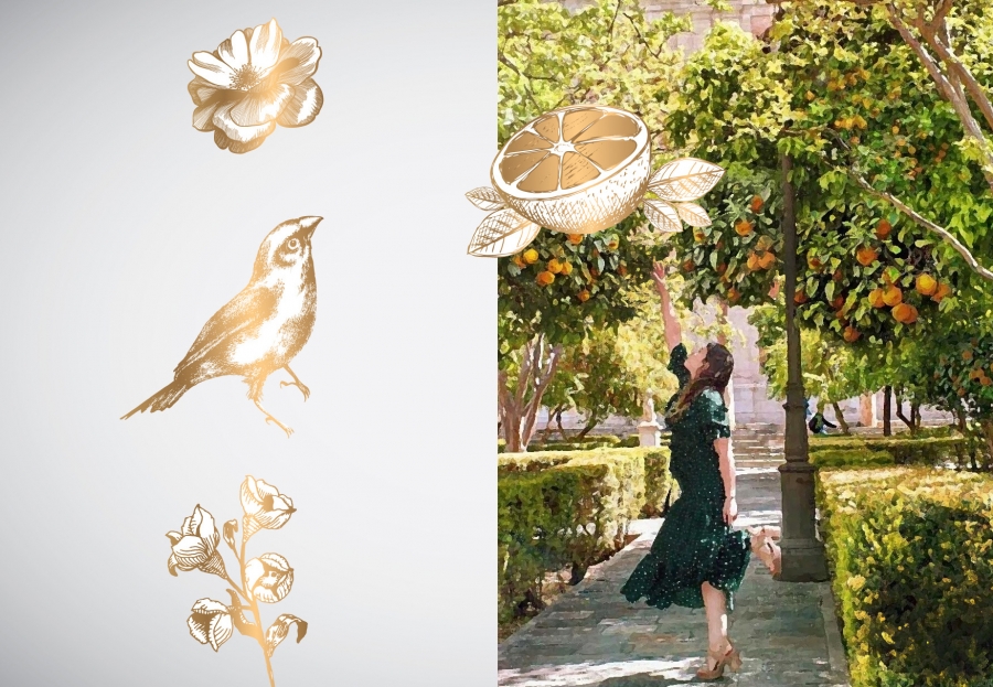
Briefing: I was given just A NAME - Sevillana AND BOTTLE of a sparkling orange session wine, born in Sevilla and brewed in California. My concern was to develop a communication that REACHES BOTH TARGET (MASCULINE AND FEMININE). The idea came up as A LOVE STORY: A BIRD (MASCULINE) FALLS IN LOVE WITH A FLOWER (FEMININE) AND HER SPARKLING “NECTAR” (ORANGE WINE). To help to tell this story I’ve used some elements: bird, flower, orange and mandalas (inspired in Sevilla’s famous tiles). I’ve also used the shape of the label to refers to a woman’s silhouette and to keep the balance I’ve chosen masculine colours (blue and copper). The logo is composed by three elements: the FAN/SUN (visuals references from Spain), ORANGE/LEAVES and THE BRAND’S NAME.
Concept / Art Director: Caterine Loures | Artwork: Caterine Loures
Client: Ripened Ventures - Sevillana
Logo | Elements | Label | Bottle cap | etc...


To comment please sign in or register.