
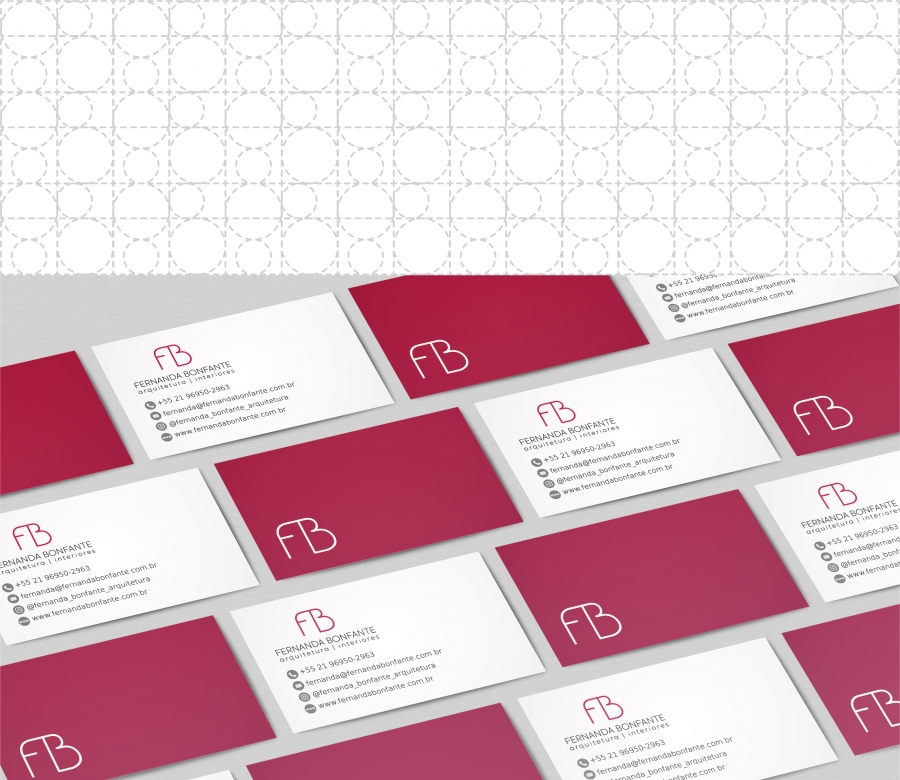
Fernanda Bonfante - Visual Identity
Brand created with Golden Ratio symmetry, very used in Fernanda's architecture studies. Rectangles and circles helped in shaping the F and B, creating these shapes that convey accessibility. The cherry color was chosen because it represents success, maturity, femininity, confidence and is very youthful.


To comment please sign in or register.