
fisio.move - Visual Identity
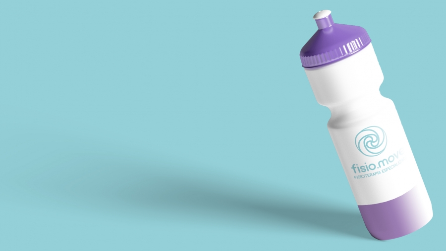
fisio.move is a physiotherapy and aesthetic company. This identity was created from keywords taken from the briefing as lightness, movement, welcoming, reliability and minimalist.
The lower case of the font brings proximity to the public, as it conveys informality. Round finishes bring comfort and welcoming. Pastel colors were chosen because they emit calmness and well-being, as well as being a trend. And the shape chosen as the symbol brings the movement that the client sought.


To comment please sign in or register.