Online Teaching Course Information Sheet

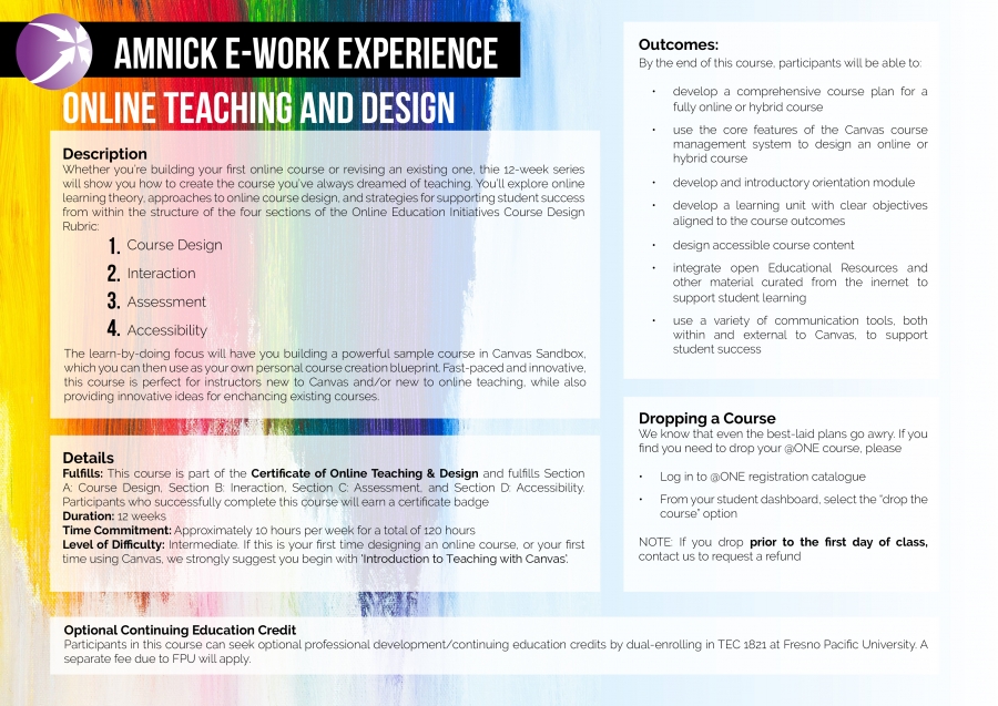
Having been given a PDF with the information on the course I was asked to make it more visual. The original PDF had the information in simple text with some symbols and images dotted around.
I focused on the design in the original that was behind the course header. It was a photo of some brush strokes in various colours. I searched for a royalty free version that was a higher definition and used that as the background.
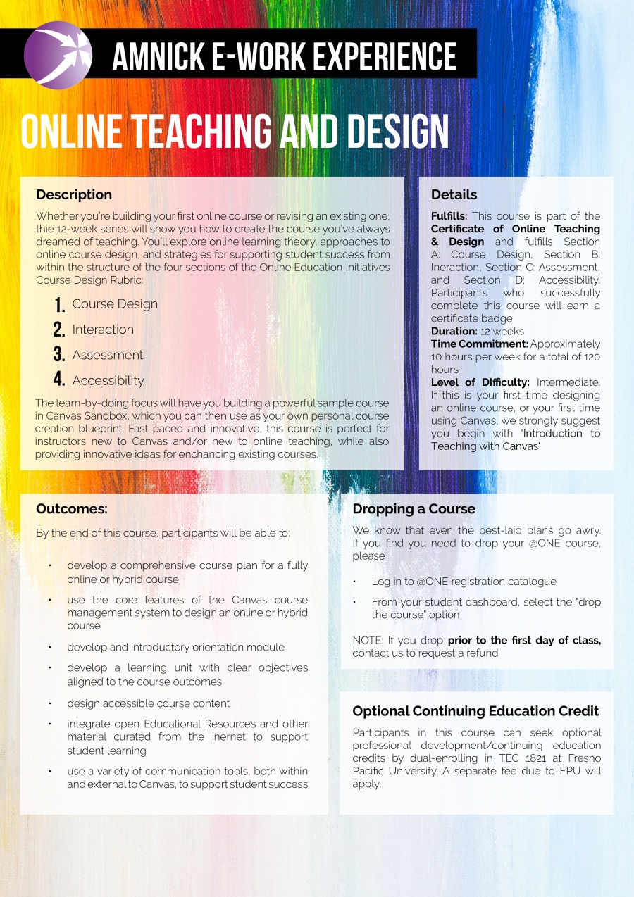
Part way through I was asked if I could add a portrait version as well in the quick turnaround time. I ended up simply adjusting the text boxed and moving them around to make them fit, though I feel like this one does need some more work on it.

As this is a work in progress I would definitely change the opacity in the boxes so that the text was more readable, but I feel that the overall design is good and that it's an eye catching and different way of showing the information than on a plain white background.


To comment please sign in or register.