First Issue of Smart Cities Magazine
There's going to be a few designs in this one, though I did not design the whole magazine I did work on a few of the pages and the final cover of the magazine.
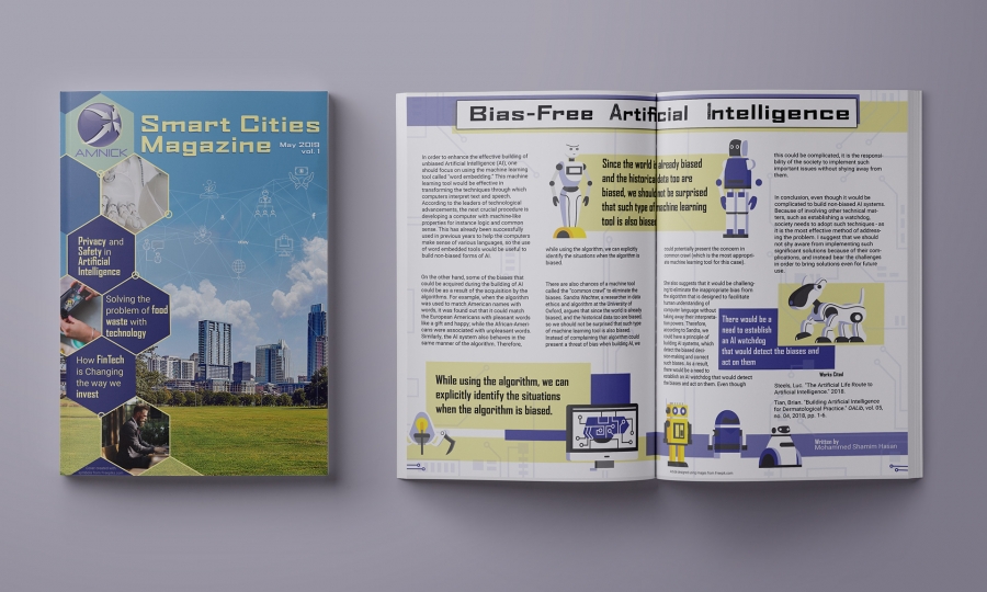
We were given an initial magazine article to work on, to make technology and smart cities less intimidating and make it friendly and easy to read for those not in the industry.
After this initial design was completed we were asked to use these same colours to create a cover. I have to admit that the colours I chose for the magazine article aren't ones I would have used if I had known this would be the case, I'm not sure that these work as well with the brief of the cover as others would have done. The cover had to include the keywords: green, nature, city, smart city, technology, people, children, work, fintech and network. I think that the design overall covers a lot of these, and the hexagons on the side link in the articles inside, though I would have chosen a different colour combination if I had the option.

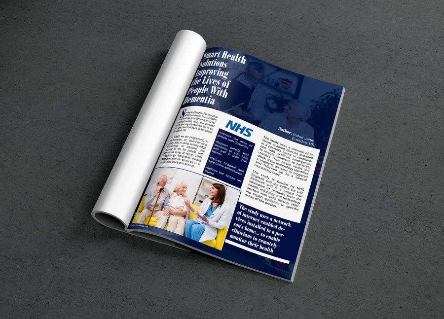
The second article I was given was on the NHS and the future of AI in healthcare. I felt that using photos rather than illustrations would work better and the blue reflects the calming theme that was in the brief, as well as being eye-catching and going with the colours of the NHS and healthcare around the world.

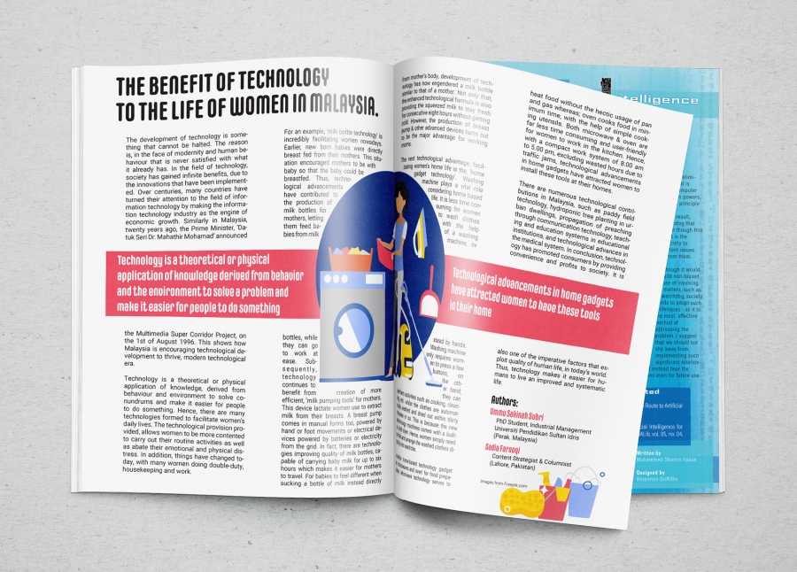
The final article that I was asked to work on was about how technology helps women in Malaysia, as the majority of the article was about washing and housework I found illustrations that reflected this, but were also simple and eye-catching. I made the bar across the middle to break up the text and include quotes of the main points of the paragraphs surrounding them. I think the fonts and text work well and it doesn't take away from the article and information.


The Cover is great.