Remaynne: Brand Refining & E-commerce (Booking) Website
Project Goals & Objectives
To refine the business brand (rebrand) and design a booking website. To reach a wider audience aside from Instagram online. To make the process of booking, viewing prices, and asking questions easy. To allow her to easily access booked clients while being able to schedule and track them.
Project Requirements
To be cost-effective. To be able to run on a mobile phone. To able to book and reschedule dates. To be able to communicate with the business owner. To be minimal and clean. To be able to collect payment into the business account.
Project Scope Description
- Rebrand: Research, Primary Logo Iterations, Secondary Logo Iterations, Icon Iterations, Logo Animation, Brand Board
- E-commerce Website: Domain Migration, CMS Creation, Online Store Front End Design, Assets/Inventory Migration & Website Design, SEO Management, Website Interface Testing, POS Vendor Sourcing, Management & Integration, Website Purchase Testing
- Inclusions: The brand name must always be in caps, “REMAYNNE”
- Exclusions: Illustrated elements
- Time: The rebrand is needed to be completed as soon as possible, the website can take time to complete properly.
- Money: The project is self-funded and from the business. Payment Installment is needed.
- Scope: All deliverables must be submitted in order to complete the project in time.
- Resources: All resources are available except website photos and videos.
- Risks: The learning curve of the business owner to use the CMS
This project would be completed in time if all factors involved are produced in time. The rebrand would be completed before the website is developed. The rebrand would be deeply completed with the business owner to ensure longevity.
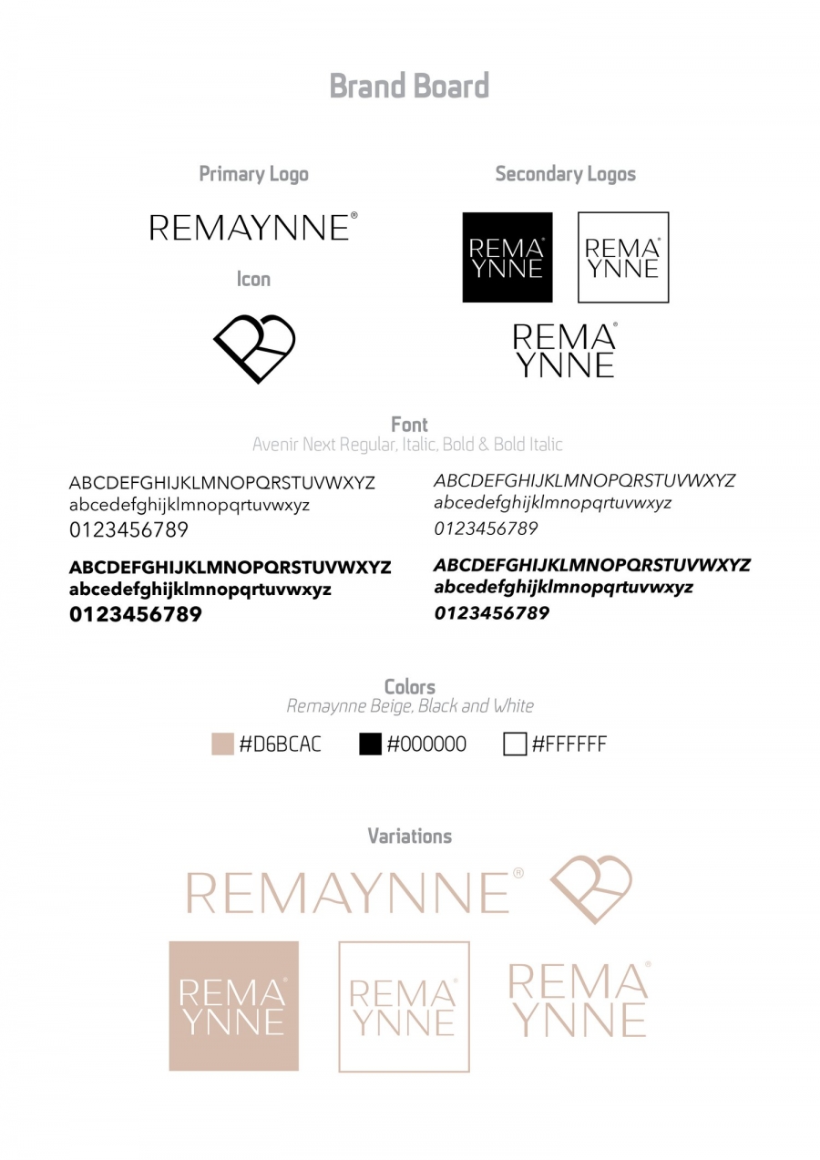
- Rebrand: Logos (JPEG & PNG), Font(s) (OTF or TTF), Color(s) (Hex Code), Logo Animation (GIF), Brand Board (PDF), Brand Usage (PDF).
- E-commerce Website: CMS Login Details, CMS Training, Payment Collection Platform Login Details, Google Business Access, Social Media Connections.
Old Logo

As always every project I undertake, I have an onboarding meeting with the client or partner to ensure we are on the same creative page and to empathize deeply with the other stakeholder. In this case, the makeup business owner wanted to improve her company’s brand. She wanted to offer makeup artistry services for booking, to reach a wider audience aside from Instagram online, to make the process of booking, viewing prices, and asking questions easy, and to allow her to easily access booked clients while being able to schedule and track them.
It was very clear what she wanted. She wanted a brand that targeted primarily brides and any woman out there who wants to look the best version of herself for photoshoots, birthdays, and any special occasion. She wanted the target audience to be WOWed! To have the feeling of, “This is who I want to book for my occasion!” They should be sold! Essentially the new brand should be very calm, peaceful, minimal, and luxurious. She then described Remaynne as a well-poised, calm, sweet, and fun-loving woman.
What struck me the most was what she wanted her audience to take away whenever they encountered the brand or website. She said,” the clients can always have a stunning look without changing who they are. They shouldn’t have to alter how they look but remain in love with their natural look. Remaynne will make them more beautiful with their natural look. Their encounter would be so powerful that the name “REMAYNNE” would always be on their minds. With this, I felt ready to dive into ideating and defining the task at hand.
From meeting with the business owner and asking questions from my design brief, I had the necessary tools to define this design problem. She needed a rebrand or brand refinement, a concise set of elements to clearly communicate her brand. She also needed a website where clients can book her services upon which she can plan a schedule accordingly. Finally, she needed to learn how to utilize all the elements of the rebrand to ensure her brand is well represented across all her business platforms and materials. The initial idea was to create a booking app. Upon sharing this idea with her, we realized the cost was too high, we also needed to ensure that the app is available in all app stores. We then settled on a website, where anyone with a browser irrespective of the operating system can access the booking service (which was cost-effective). Now that we knew what exactly we wanted to create and have defined a solution, it was time to prototype.
Prototyping
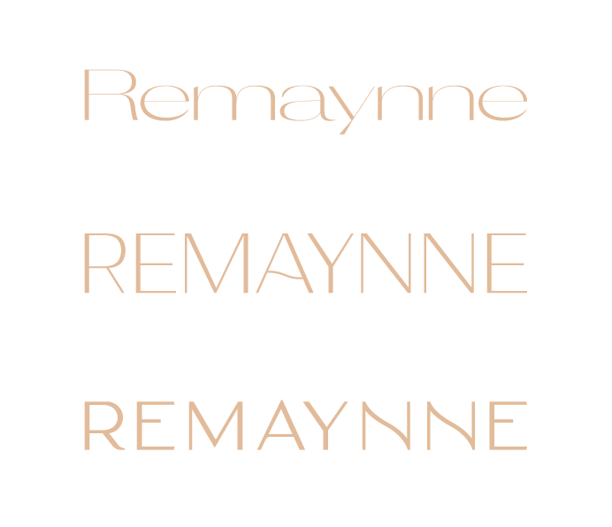
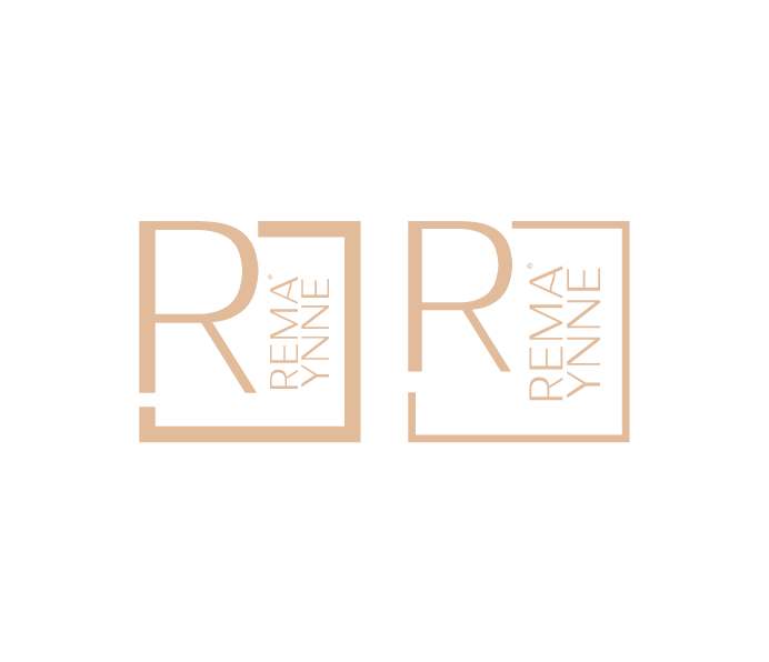
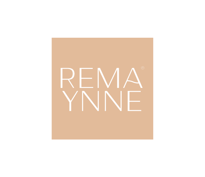
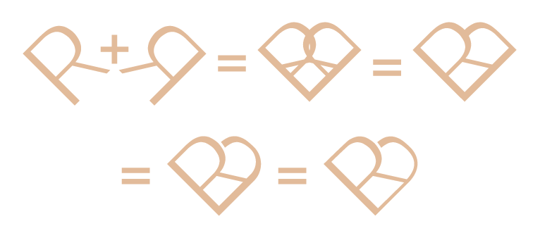
Generating various iterations for the brand took some months. The business owner and I met frequently to ensure we were happy with the direction the new brand was taking. I started off with the primary logo. After we agreed on the one we loved, we then progressed to the secondary logo, icon, colors, and usage. I ended the prototyping stage with an animation to clearly communicate the tagline of the brand, “Remain in Love”. The website also went through several iterations, all the user experience and user interface iterations took place on a holding website. Prototyping is still ongoing as we are learning from feedback from users who are currently testing the website. Below are some visual representations of the prototyping process with the final brand board. The link to the website is in the “Testing” section below.



To comment please sign in or register.