Logo Design for The Tarrington


The Tarrington Pub, nestled in Hereford, boasts a heritage spanning decades. They wanted a logo that pays homage to its past and welcomes both regulars and newcomers with warmth.
I delved into traditional pub aesthetics, exploring classic typography and historical insignias. Inspired by vintage signage and British imagery, we aimed for a nostalgic and authentic feel. Through sketches and digital mock-ups, we honed various ideas, ensuring each reflected the pub's local roots.
Feedback sessions were key in refining the design. We adjusted colors, fonts, and overall impact to strike a balance between tradition and modernity, appealing to both long-standing patrons and younger crowds.
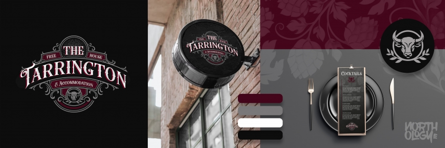
The final logo exudes The Tarrington Pub's essence, capturing its quality, community, and welcoming atmosphere. It received enthusiastic praise upon unveiling, appreciated for its timeless charm and cohesive representation of the pub's values. This versatile design seamlessly integrates across signage, menus, merchandise, and digital platforms.


To comment please sign in or register.