+Nutrir - Brand Design
In a market that values health and well-being, +NUTRIR stands out as a top natural products brand. Many brands use overused green leaf symbols and complicated designs, so there is a strong need for differentiation.
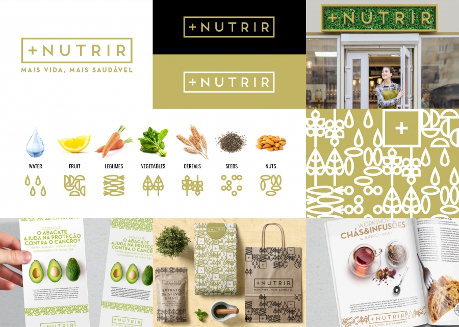
+NUTRIR focuses on simplicity, elegance, and a modern vintage style. The key design elements are:
• Rectangle: A clear shape that symbolizes precision and simplicity.
• Color Palette: A bold mix of earthy browns and natural greens.
• Classic Typeface: Timeless and stylish, representing the brand’s identity.
• “+” Symbol: Integrated into the name to enhance the brandimage and symbolize health.
• Rectangle: A clear shape that symbolizes precision and simplicity.
• Color Palette: A bold mix of earthy browns and natural greens.
• Classic Typeface: Timeless and stylish, representing the brand’s identity.
• “+” Symbol: Integrated into the name to enhance the brandimage and symbolize health.
The visual identity reflects key aspects of a healthy lifestyle, including water, fruits, vegetables, cereals, seeds, and nuts. This allows for the creation of eye-catching striped patterns. The color palette flows from vibrant greens to rich earth tones, clearly communicating product qualities.


To comment please sign in or register.