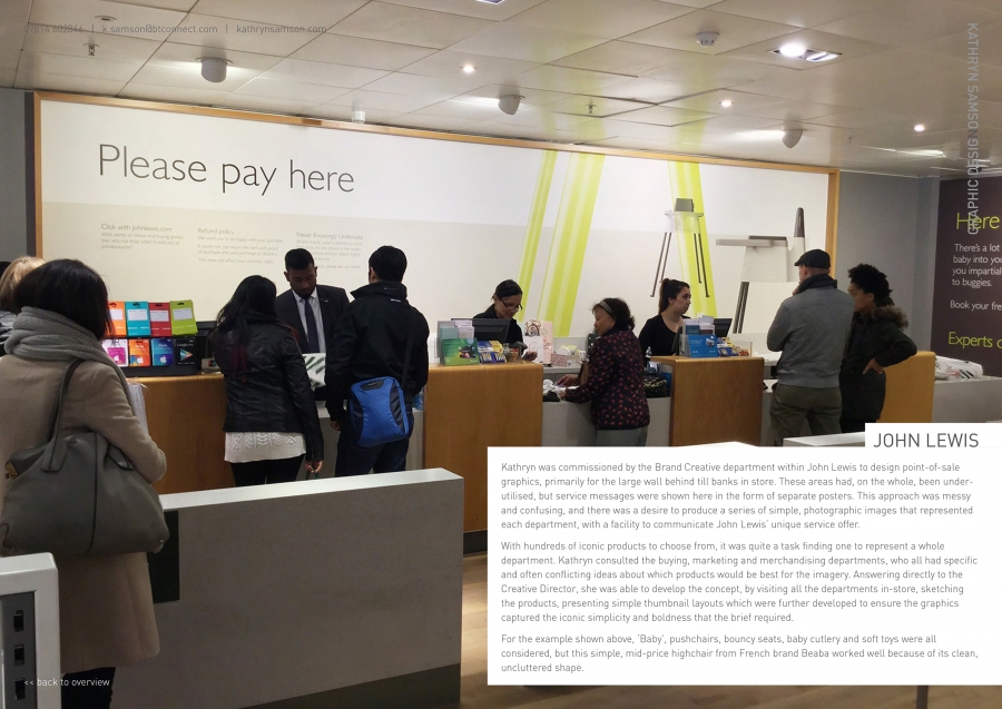
Kathryn was commissioned by the Brand Creative department within John Lewis to design point-of-sale graphics, primarily for the large wall behind till banks in store. These areas had, on the whole, been under-utilised, but service messages were shown here in the form of separate posters. This approach was messy and confusing, and there was a desire to produce a series of simple, photographic images that represented each department, with a facility to communicate John Lewis’ unique service offer.
With hundreds of iconic products to choose from, it was quite a task finding one to represent a whole department. Kathryn consulted the buying, marketing and merchandising departments, who all had specific and often conflicting ideas about which products would be best for the imagery. Answering directly to the Creative Director, she was able to develop the concept, by visiting all the departments in-store, sketching the products, presenting simple thumbnail layouts which were further developed to ensure the graphics captured the iconic simplicity and boldness that the brief required.
For the example shown above, ‘Baby’, pushchairs, bouncy seats, baby cutlery and soft toys were all considered, but this simple, mid-price highchair from French brand Beaba worked well because of its clean, uncluttered shape.
No one has liked this image yet, why not be the first!


