COCA-COLA CROPPED LOGO CAMPAIGN
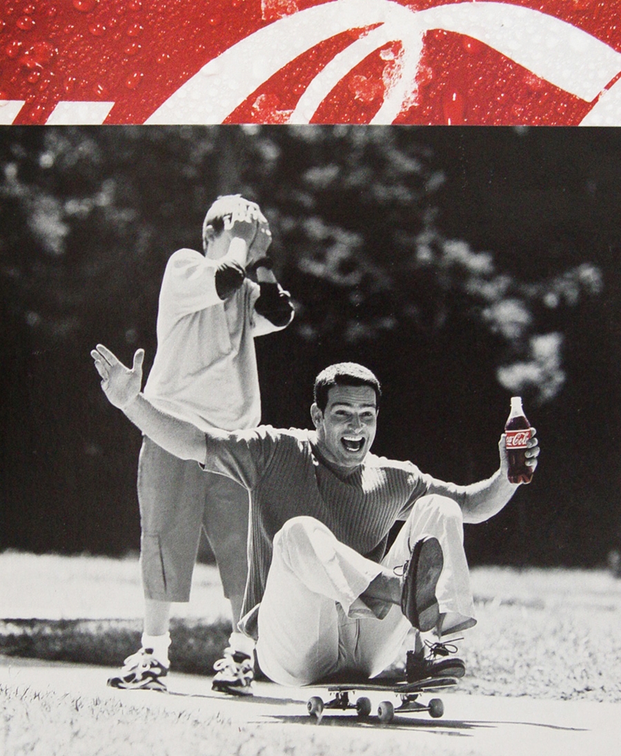
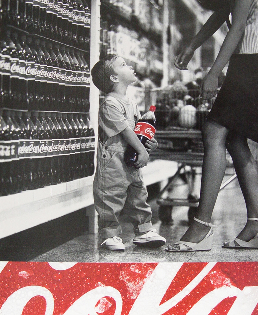
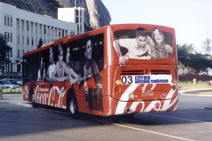
An interesting detail of this campaign is that the logo does not appear entirely - it is always cropped. How dare a brand do that? Coca-Cola dares! GIVING MORE ROOM TO THE EMOTION OF THE PHOTO THAN ITS OWN LOGO. Also, in this work for Coca-Cola, it was possible to show that an advertising campaign can be easily adapt to different medias.
Art Director: Caterine Loures | Photographer: Thomas Susemihl | Photo shoot Art Direction: Caterine Loures
Agency: McCann-Erickson | Client: The Coca-Cola Company


To comment please sign in or register.