Company Information Leaflet
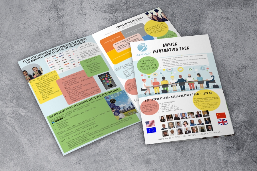
The brief for this project was to include all the information on a series of slides on a Powerpoint presentation, include as many of the images used as possible and somehow tie it all together on an A4 double sided handout. The turnaround time was under 2 weeks and they needed to be printed to be taken for an international conference in America.
I chose to use the simpler design for the front and go for a folded over leaflet as it seemed to fit four pages with different topics, rather than trying to separate them on two sides of A4.
I picked colours from the image that I chose for the cover and used circles to separate the points that were on the powerpoint. As there were no paragraphs of writing for the majority of the information, this seemed a simple way to separate the points while being easy to understand for the reader and meant that there wasn't a lot of empty space like on slides.
As the information and certain images were compulsory to include, some of it didn't turn out as I would have originally designed as I would have chosen different images or a different layout for them, but I think that it was an effective way of getting the information across.


To comment please sign in or register.