Bartek Dąbrowski is a powerhouse of music; classically trained on the guitar his finger-picking rhythms and melodies leave many a crowd wide-eyed in amazement.
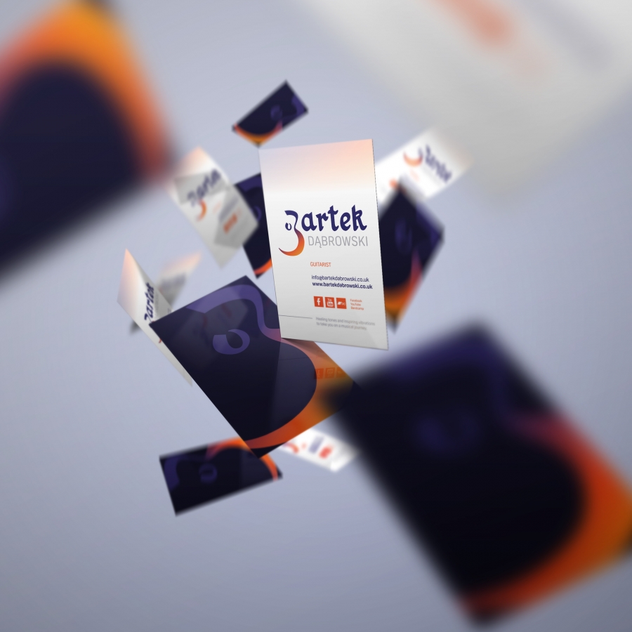
Bartek and I initially worked together on creating a logo that represented his style of music, his inspirations and his character that could later be rolled out over various promotional materials to be displayed whilst he was busking or performing.
The final icon and logo, versatile in their application, fulfilled their purpose and brief in 3 parts; firstly, the icon subtly hints at the outline of a classical guitar – Bartek’s instrument of choice; secondly, it can be viewed as a “B” and be the basis for the wider text-based logo and thirdly, it follows the shape and weight of the “ohm” symbol – an icon of peace and something which Bartek specifically stated he loved.
Following the logo project we developed a range of items including a business card, artwork for Bartek’s new CD, Balance, updated artwork on his older CD, Escape to the Happiness and an eCommerce website for music sales and further information. The eCommerce website was an important next step for Bartek as his performance rate and followers grew. Now, thanks to the website, Bartek’s listeners are able to purchase either physical copies of his CDs or downloadable versions in mp3 or wav formats. As Bartek’s musical library and journey grows, so too can his website.
View full project:
https://www.emilymerchant.co.uk/project/bartek-dabrowski/
Siphe Ngcai, Georgie Tann and 5 others like this.
logo design
branding
graphic design
website design
business card design


