The layout of your portfolio can clearly have an impact on the way that your work is perceived. Whether you choose to display images as single shots, or set them up in a new format, might make a difference as to whether you get that job or not. We spoke to some inspiring members at Freelancer Club whose portfolios feature an interesting layout or presentation choice. Take their tips to freshen up your profile!
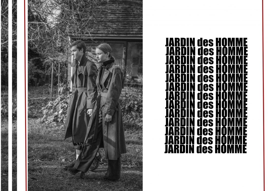
KYVELI CHARALAMPIDOU
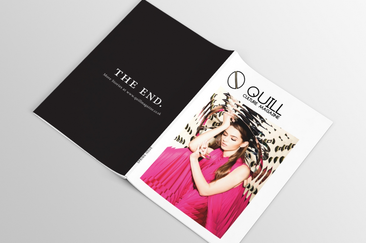
Talking about the power of layout, Kyveli said: “It will give an idea of how your project will look if you want, for instance, to emphasise elements… I wanted to show more photos of the magazine’s different styles, layouts etc. I am a designer, after all. I want to showcase my work the best possible way so I can get hired by potential clients.”
Presenting her work in this way allows Kyveli to demonstrate that it is being used out in the real world - and shows her understanding of how her designs are used.
BEN MCCABE
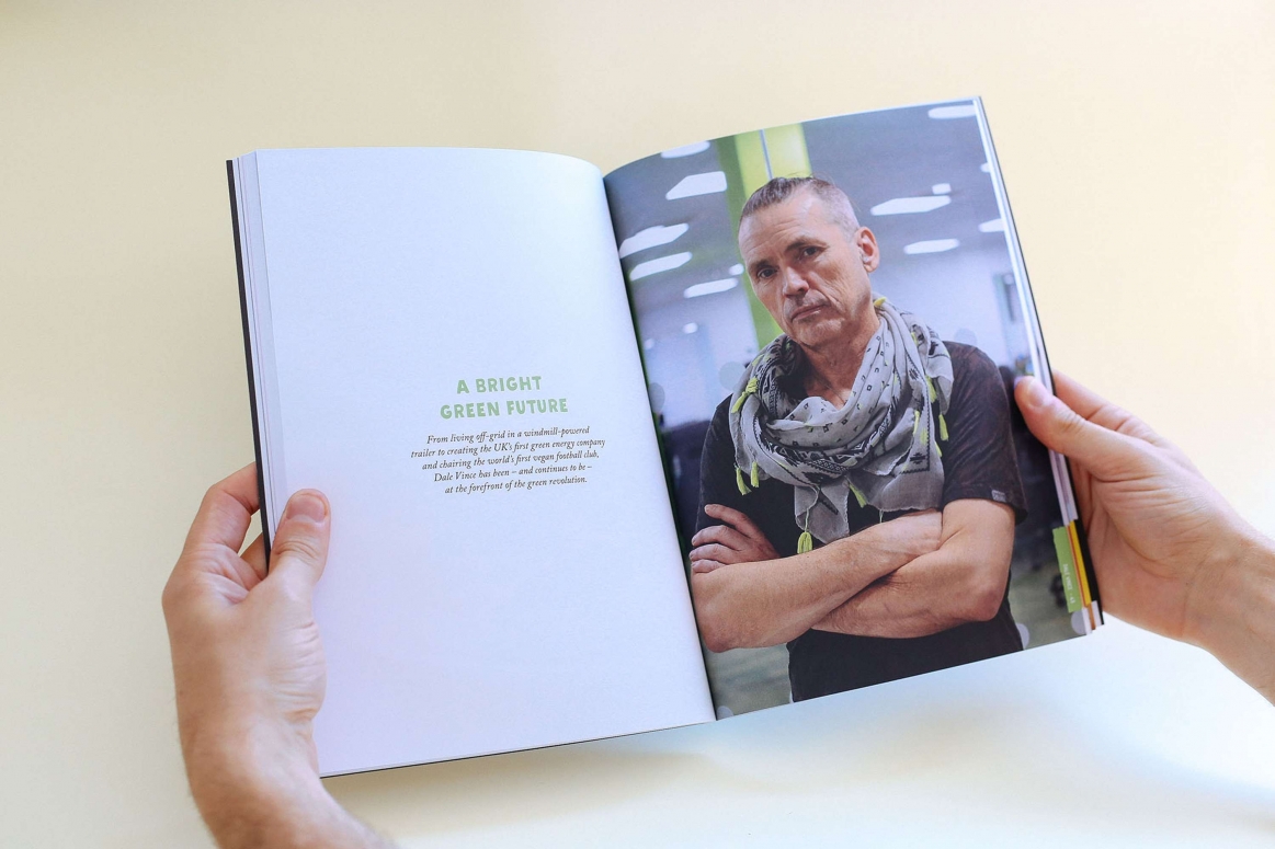
This intriguing presentation really puts the viewer into the position of being a reader of the magazine. It gives a tangible sense to Ben’s work, making it more ‘real’ than a simple layout. It also shows the impact this design held within the broader context of the print copy.
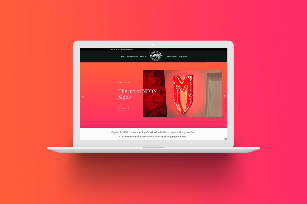
NARCIS SAULEDA
Narcis said: “The reason why I show mock ups instead of the designs is to show designs in context. I tend to use mock ups with design proposals and to show ideas so the client can imagine how the designs would look in real life.”
Showing a magazine mock up instead of a simple tearsheet means that anyone who browses Narcis’ portfolio knows he can produce the real thing.
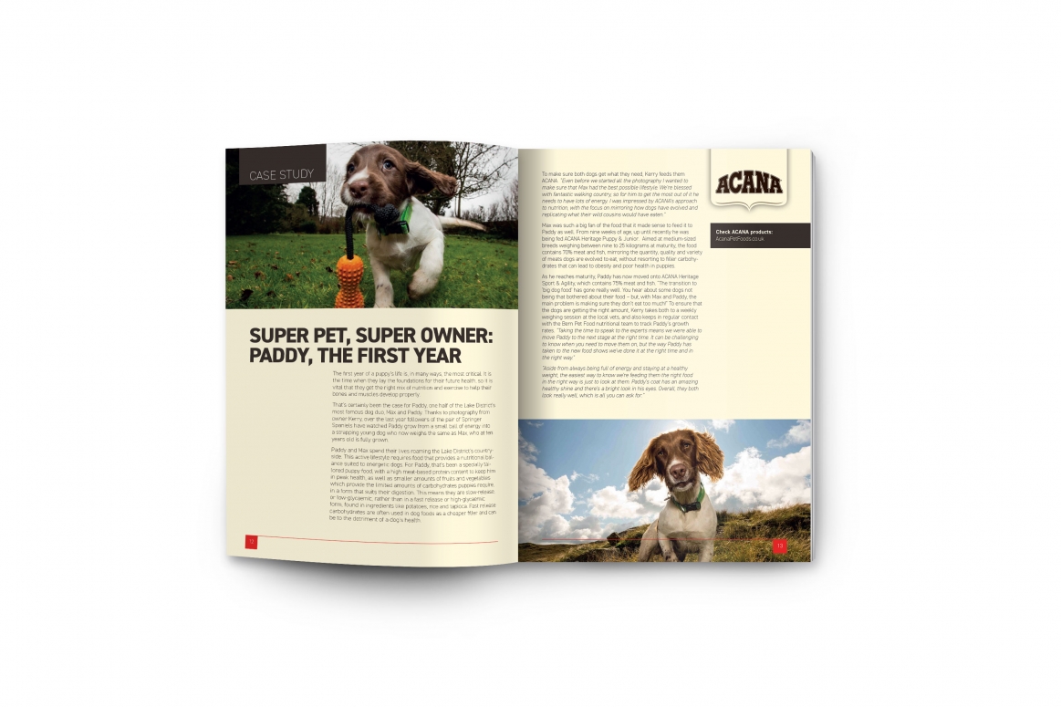
GINO WARD
The use of a magazine page, including text and graphic elements, shows that Gino knows how his work can be used. He also demonstrates the use of a strong technique: creating white space in an image to allow graphic designers more space to play.
ISABELLA HEWLETT
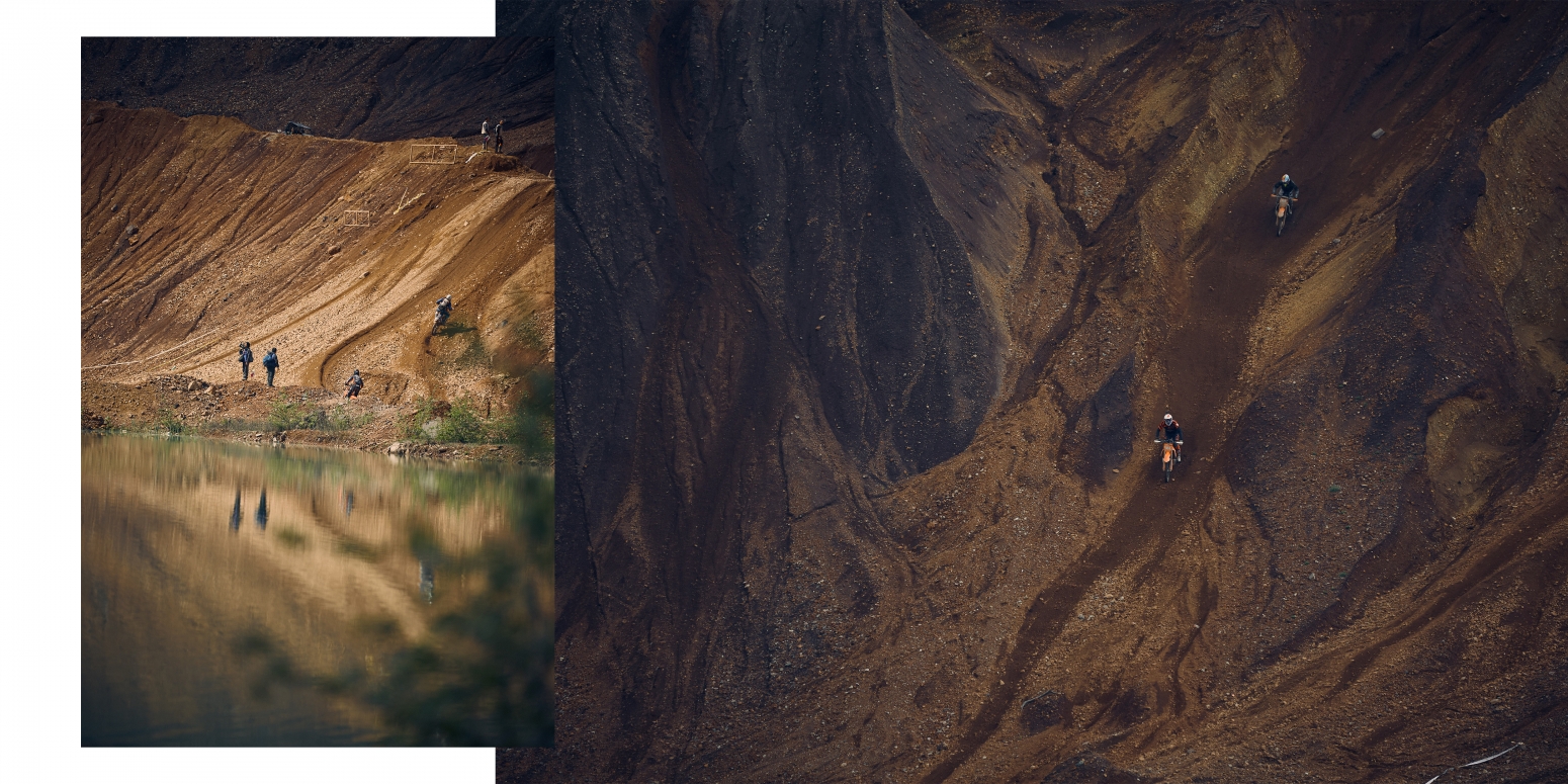
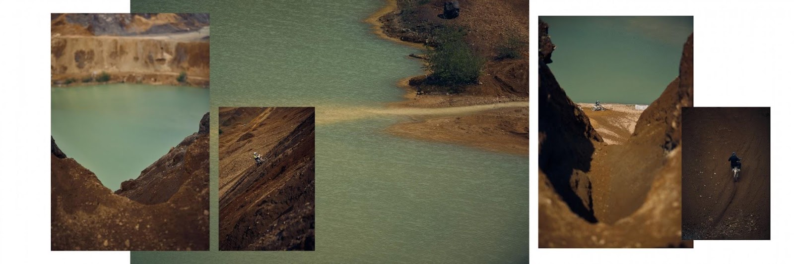
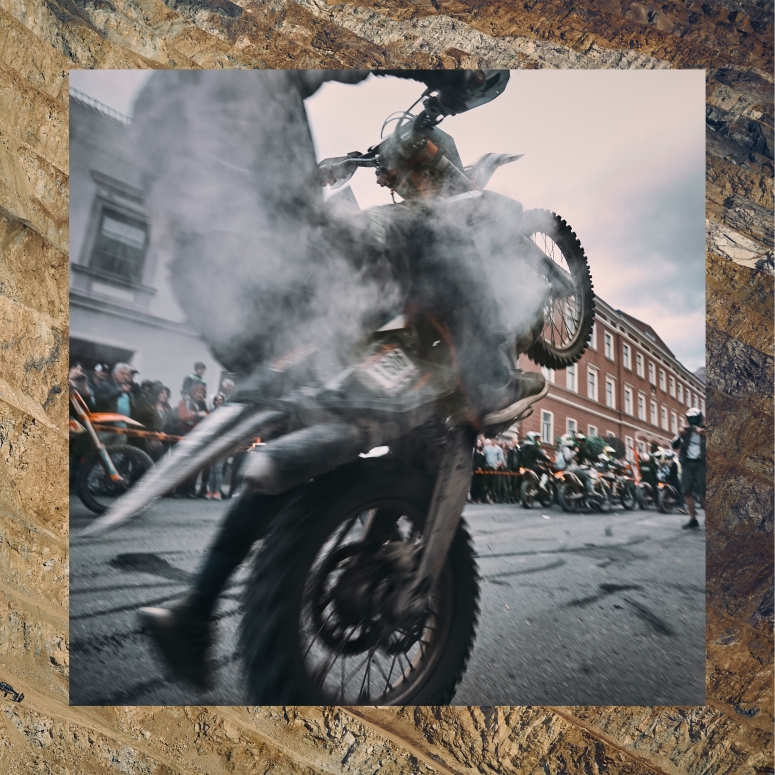
Isabella said: “The layout was in response to how I had previously decided to curate my Instagram page. I knew that I would limit myself to 3 posts for this job as to keep my overall layout and sequencing intact. However, I really struggle to limit my image choices with this particular job, as it varies so much on a daily basis. In previous years I chose only to share the most exciting and visually stimulating images. This time I felt that I had to find a visual representation that would be capable of enabling the viewer to get a feel of the location, as well as individual moments and stories I had chosen to highlight.
“So with the example of the „bankerlrutscher“ in mind, I wanted the viewer to feel like we were at the foot of the mountain like I was, at the end of another day at the Erzbergrodeo. So you get this quick moment to catch your breath, looking at the mountains, and when you turn around you’re entering this tent filled to the brim with people from all nations, all brought together by their love of enduro races. It’s hot, loud and the mood is ecstatic and there’s this crowd of absolutely crazy people giving this surge of heightened emotions an outlet by throwing themselves off of stacked benches fashioned into a slide. I guess it was the only way I found to effectively recreate my experiences in a visual manner.”
Isabella’s presentation is eye-catching and unique. It also unifies the series, allowing both context and detail at once with plenty of atmosphere.
JACK ATKINS
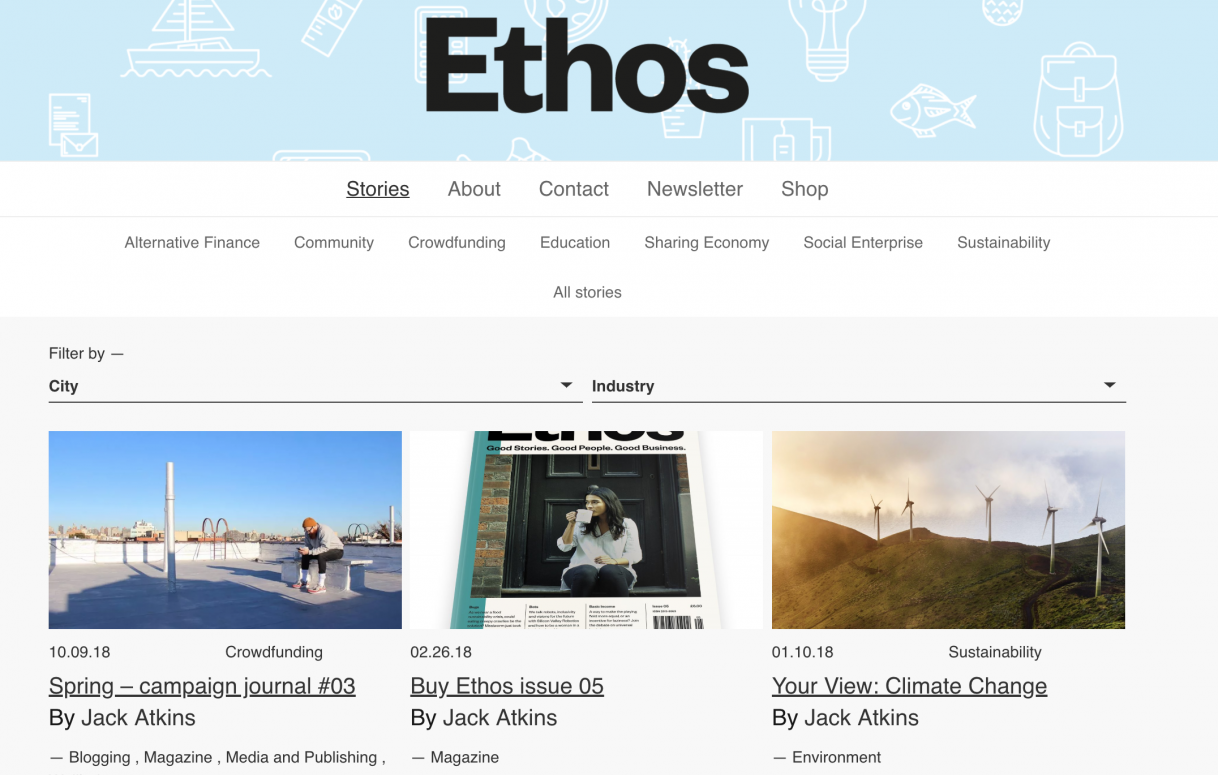
As a writer, Jack’s portfolio might not be very visual. However, by using a screenshot like this, he demonstrates that his work has been published and presents it in a visual way that stands out!
There are plenty of creative ways you can display your portfolio, no matter your discipline. So, get cracking and try something new!
Cover photo: KYVELI CHARALAMPIDOU


